You are using an out of date browser. It may not display this or other websites correctly.
You should upgrade or use an alternative browser.
You should upgrade or use an alternative browser.
Your opinion on these shockbox-inserts please
- Thread starter Arcade-TV
- Start date
Arcade-TV
Tarma's Gun Polisher

- Joined
- Dec 30, 2009
- Posts
- 109
Screenshots are inverted though.
Great! Thanks!
Inverted? That's strange...
It's supposed to look like this:
Glad I could help. I like how you changed the golf ball details.
I made two screenshots which are closer to those on the AES cover (courses in the Japanese order, 2p mode highlighted), in case you need it:


Also it seems a space is missing between of and four in the English text part.
I made two screenshots which are closer to those on the AES cover (courses in the Japanese order, 2p mode highlighted), in case you need it:
Also it seems a space is missing between of and four in the English text part.


Arcade-TV
Tarma's Gun Polisher
- Joined
- Dec 30, 2009
- Posts
- 109
s it intentional?
Yes. To make it more readable. Also I think it's not a bad thing when these inserts will be different from the AES ones. Of course it would be nice to have a full set of inserts identical to the home-carts, but there are at least two reasons why this is impossible:
1. There just is no AES insert for some games
2. I have like 75 AES games, not complete at all - somebody would have to provide pro-quality scans.
Well, I try to handle this situation like this:
Either there is a high-res scan among my assets, otherwise I make use of other artwork that I have, if no high-res art is available at all I try to blow-up low quality artwork using vector-based algorhythms. If all that fails the insert has to wait. I'm for "quality before quantity".
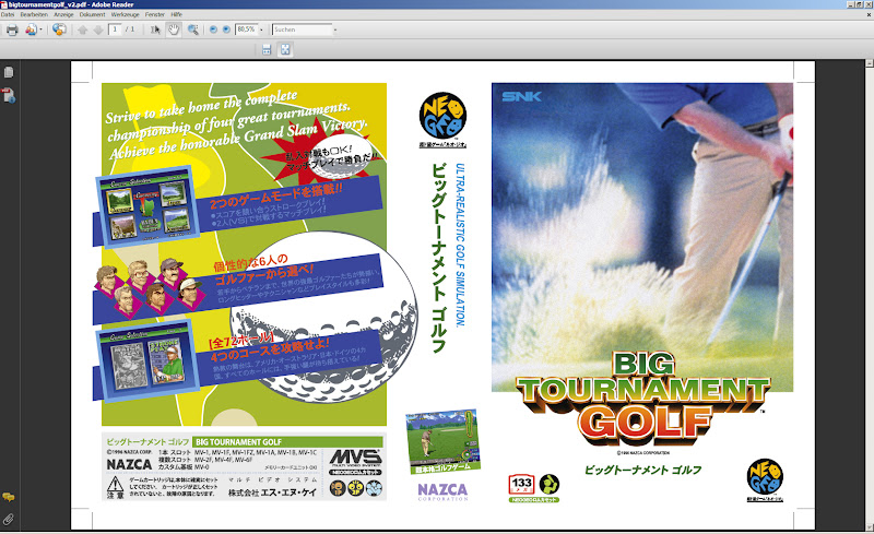
In this particular case of "Big Tournament Golf" is was like that:
-had no hi-res scan
-was able to rebuild logo
-got ahold of the "golfer" photo/artwork, but had to blow it up
-made vectors from the back-background image
-got the jap text from you
Indeed, I think it's a good thing if custom inserts aren't identical to AES ones. In this particular case (the red star) if you tried both way to handle it, I'm sure you picked the best one.
By the way, how did you rebuilt the Big Tournament Golf logo? It seems to me you kept the "perspective part" of the letters and redid the letters themselves.
By the way, how did you rebuilt the Big Tournament Golf logo? It seems to me you kept the "perspective part" of the letters and redid the letters themselves.
Arcade-TV
Tarma's Gun Polisher
- Joined
- Dec 30, 2009
- Posts
- 109
how did you rebuilt the Big Tournament Golf logo? It seems to me you kept the "perspective part" of the letters and redid the letters themselves.
You're so right.
Good observation skills
")
I blew up the logo but the inside of the letters came out flaky, so I drew vectors on top of them and kept the rest.
- Joined
- Nov 16, 2001
- Posts
- 4,042
Awesome. I tried to do the same (minus vectors) many years ago and gave up because it was too much work and the result wasn't what i was aiming for.
Two things:
1.
I think the nasca logo on the spine would look better in black
2.
Your samurai spirits 2 insert says samurai SHODOWN in the box on the back. I'd change that to sporits.
Edit:
Third thing ...
The back of the big tournament golf insert ... Bottom right ... The 3 symbols for one player, two play and the type of game ...-> it says it's a fighting game
Last edited:
Arcade-TV
Tarma's Gun Polisher
- Joined
- Dec 30, 2009
- Posts
- 109
Sorry it took some time! This was a tough one..I just got my first Japanese MVS game, it's world heroes 2. I saw you did a part 1, If you decide too make wh2 I would definitely appreciate it. Funny thing is I spent more on the shock box then I did the game :-)


I'd love to see a photo of this in your shockbox! Can u do that?
Last edited:
Arcade-TV
Tarma's Gun Polisher
- Joined
- Dec 30, 2009
- Posts
- 109
Easy change. Are you others ok with that?I think the nasca logo on the spine would look better in black
erm, yeah... well...Your samurai spirits 2 insert says samurai SHODOWN in the box on the back. I'd change that to sporits.
This was actually intended.
I thought this way both titles could co-exist.
On the other hand: you're right. This is supposed to represent the jp version of the game so keeping the jp titles might be a good idea, gotta admit that...
Nope, it doesn'tThe back of the big tournament golf insert ... Bottom right ... The 3 symbols for one player, two play and the type of game ...-> it says it's a fighting game
This is a bit confusing, I know... but that icon means "competitive play". Got it from an old "software line-up" flyer.
There is one insert I made where "competitive" didn't apply... dunno which it was, I'll have to look it up. In that case I used the genre icon as third symbol.
Fighting icon is the flaming-fists-thingamajig.
Great Feedback! Thanx!
edit: it was the strikers1945 insert where "competitive" didn't apply.
Last edited:
- Joined
- Nov 16, 2001
- Posts
- 4,042
Ooops, my bad.
The reason why i thought the shodown looked odd is that it says spirits on the front.
I also have a few suggestions for the strikers inserts, but i'll tell you in german via pm. Probably in early august, when i have the time to spare. Didn't forget about the scans either, just really busy at the moment.
But yeah, you're doing an incredible job. Keep it up, please.
Arcade-TV
Tarma's Gun Polisher
- Joined
- Dec 30, 2009
- Posts
- 109
I did those freakin icons a while back.
made a quick-reference card for y'all:
GENRE-ICONS (PDF Download)
made a quick-reference card for y'all:
GENRE-ICONS (PDF Download)
Arcade-TV
Tarma's Gun Polisher
- Joined
- Dec 30, 2009
- Posts
- 109
Puzzle Bobble - Inserts Galore
This will be one of the last inserts before my vacation.
I've spent the whole day making this fully vector-based! Only the screenshots are pixel-graphics, everything else is anchors 'n curves.
ENJOY!
PINK (the classic puzzle bobble flavor)


RED


YELLOW


GREEN


BLUE


GREY


PURPLE GRADIENT (Playfield Colors)


So... what's your favourite color?
This will be one of the last inserts before my vacation.
I've spent the whole day making this fully vector-based! Only the screenshots are pixel-graphics, everything else is anchors 'n curves.
ENJOY!
PINK (the classic puzzle bobble flavor)
RED
YELLOW
GREEN
BLUE
GREY
PURPLE GRADIENT (Playfield Colors)
So... what's your favourite color?
Last edited:
Arcade-TV
Tarma's Gun Polisher
- Joined
- Dec 30, 2009
- Posts
- 109
I might be putting printable files on hold for future releases due to missing feedback. See, the thing is, once an insert is ready it's real hard to work on it again after some time.
And - this is also important - getting no feedback at all is really frustrating and I just don't wanna feel bad for releasing stuff like that.
Yeah, maybe I'm being a p...y about it, but nobody ever left a reply for KOTM2, WHeroes2 and now the PBobble inserts and that kinda sucks for me - just being honest...
- Joined
- Aug 23, 2011
- Posts
- 3,510
please don't be discouraged! Your inserts are hands down, the best I've ever seen. I'm trying to collect Jp label mvs carts and these would be perfect for that. I have loved every single one you've done, even this metal slug is top notch! I'm not in a position right now to print and use these, but I've seen the work you've done and it's great stuff.
Arcade-TV
Tarma's Gun Polisher
- Joined
- Dec 30, 2009
- Posts
- 109
please don't be discouraged! Your inserts are hands down, the best I've ever seen.
Well, You see... I'm not fishing for compliments! I want you to give me your ideas, critism, stuff like that.
In the end you can all prosper from that.
- Joined
- Aug 23, 2011
- Posts
- 3,510
Well, You see... I'm not fishing for compliments! I want you to give me your ideas, critism, stuff like that.
In the end you can all prosper from that.
I can't help you with criticisms, because I've liked every one I've seen right out of the gate. I realize that might not be helpful for you, but I am just really happy to see you supporting jp style labels.

- Joined
- Jan 22, 2012
- Posts
- 7,613
I hope you keep making them Alex cause they're looking great. Im just waiting until you make some more of the games I have and then im going to get printing. I reckon once you see people post pictures of these inserts with their collection that is all the motivation you'll need. ")
Keep up the good work
Keep up the good work