- Joined
- Jun 3, 2003
- Posts
- 547
I'm finally getting around to having inserts printed up for my Shockboxes (only 4 years late). There are lots of insert styles to choose from, but they seem to mainly come in two styles. The first one is those of the US original home games. Basically someone scanned (or recreated) the actual AES box insert and sized it for the Shockbox. These inserts have artwork that is cropped to fit only the front of the box and have a gray boarder and spine. The name of the game is also printed on the front of the box in addition to the spine. These boxes all look very uniform and similar when viewed from the side. Big Bear did most of these, or so it would appear.
The second style is similar to the the first except the artwork has been blown up to fill the entire front of the box, and the colors (and ocassionaly the artwork itself) extends to the spine. Therefore everything doesn't look uniform (lots of different colors) and the name of the game only appears on the spine. This style looks very similar to the Japanese home releases, except the name has been taken off the front (why?). It looks like NeoCverA and Xian Xi did the bulk of these.
Here are examples of the two styles (click on each one to see a bigger picture):
Andro Dunos Original: http://southtown-homebrew.com/product_info...;products_id=39
Andro Dunos New Style: http://southtown-homebrew.com/product_info...products_id=647
3 Count Bout Original: http://southtown-homebrew.com/product_info...;products_id=28
3 Count Bout New Style: http://southtown-homebrew.com/product_info...products_id=752
Baseball Stars 2 Original: http://southtown-homebrew.com/product_info...;products_id=49
Baseball Stars 2 New Style: http://southtown-homebrew.com/product_info...;products_id=51
Cyber Lip Original: http://southtown-homebrew.com/product_info...;products_id=83
Cyber Lip New Style: http://southtown-homebrew.com/product_info...products_id=724
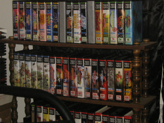
You get the picture. I'm actually kind of torn here. Originally I wanted my boxes to look exactly like the originals in every way, but once I saw a row of them on a shelf, I realized how boring the all look. Everything is that same dull uniform barf gray (or occasionally some other color). You can see what I mean in this picture: http://www.neo-geo.com/gallery/collections/HarryHazard/1.jpg
I'm actually starting to like the look of the "new style" since it breaks up the monotany a bit and looks much more colorful. I'm not 100% sold on it yet though. One thing I wish is that the name of the game was put back on the front, because it looks really odd without it.
What is everyone elses opinions on this? Should I stay with the traditional look or go with the "new style"?
The second style is similar to the the first except the artwork has been blown up to fill the entire front of the box, and the colors (and ocassionaly the artwork itself) extends to the spine. Therefore everything doesn't look uniform (lots of different colors) and the name of the game only appears on the spine. This style looks very similar to the Japanese home releases, except the name has been taken off the front (why?). It looks like NeoCverA and Xian Xi did the bulk of these.
Here are examples of the two styles (click on each one to see a bigger picture):
Andro Dunos Original: http://southtown-homebrew.com/product_info...;products_id=39
Andro Dunos New Style: http://southtown-homebrew.com/product_info...products_id=647
3 Count Bout Original: http://southtown-homebrew.com/product_info...;products_id=28
3 Count Bout New Style: http://southtown-homebrew.com/product_info...products_id=752
Baseball Stars 2 Original: http://southtown-homebrew.com/product_info...;products_id=49
Baseball Stars 2 New Style: http://southtown-homebrew.com/product_info...;products_id=51
Cyber Lip Original: http://southtown-homebrew.com/product_info...;products_id=83
Cyber Lip New Style: http://southtown-homebrew.com/product_info...products_id=724
You get the picture. I'm actually kind of torn here. Originally I wanted my boxes to look exactly like the originals in every way, but once I saw a row of them on a shelf, I realized how boring the all look. Everything is that same dull uniform barf gray (or occasionally some other color). You can see what I mean in this picture: http://www.neo-geo.com/gallery/collections/HarryHazard/1.jpg
I'm actually starting to like the look of the "new style" since it breaks up the monotany a bit and looks much more colorful. I'm not 100% sold on it yet though. One thing I wish is that the name of the game was put back on the front, because it looks really odd without it.
What is everyone elses opinions on this? Should I stay with the traditional look or go with the "new style"?