Shawn
snkusa.com
- Joined
- Aug 11, 2000
- Posts
- 2,503
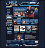
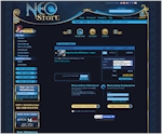
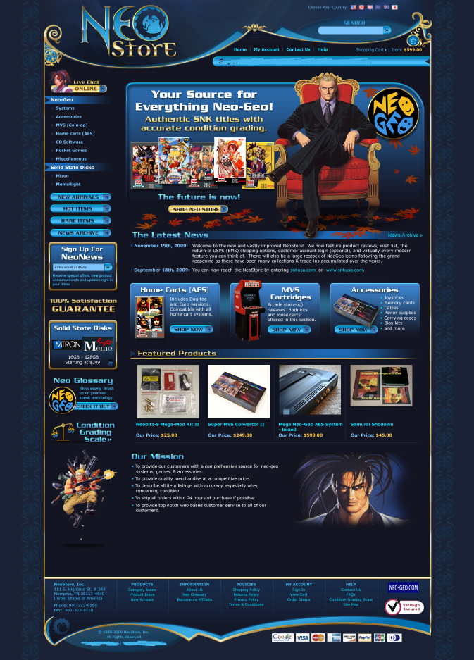
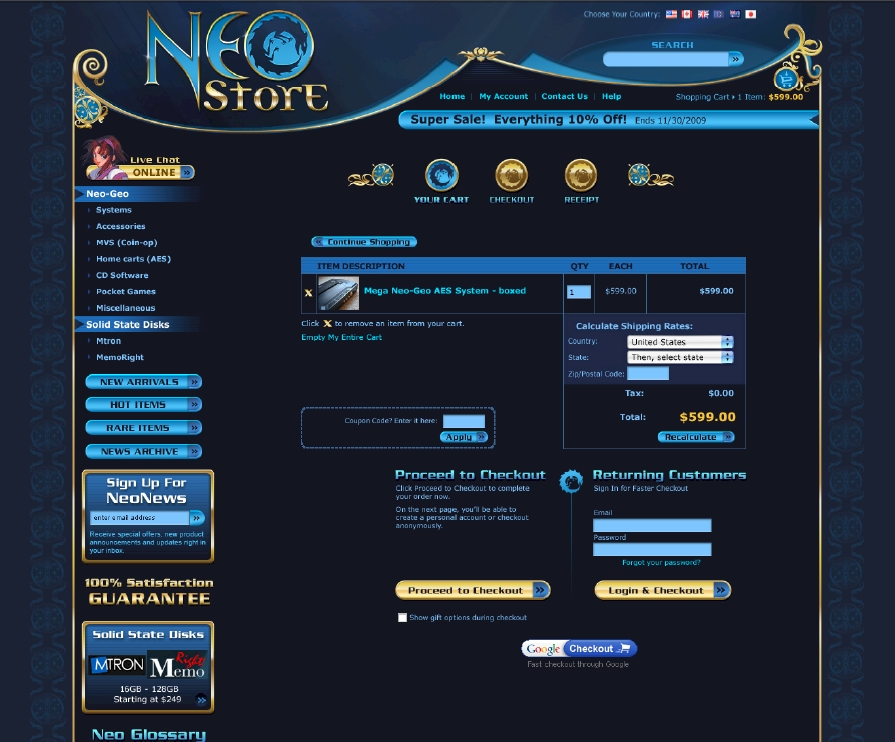
The NeoStore's facelift is in the final stages and should be published within the coming weeks. Please share any opinions that come to mind for improving upon this design. The logo is finalized but virtually anything else you see can be modified. Constructive criticism is welcome. Thanks!
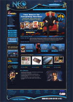
Older concept with Japanese rooftop style for top border:
I’m currently undecided on which border is optimal. If the gilded/embellished design is the best choice then bottom border will be modified to match the style of the top border.
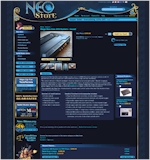
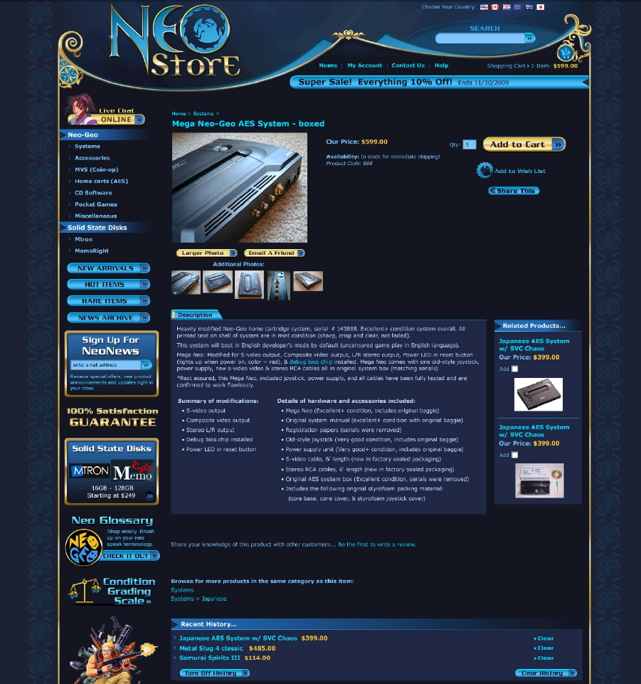
Item detail template:
Shopping cart template:
Older concept with Japanese rooftop style for top border:
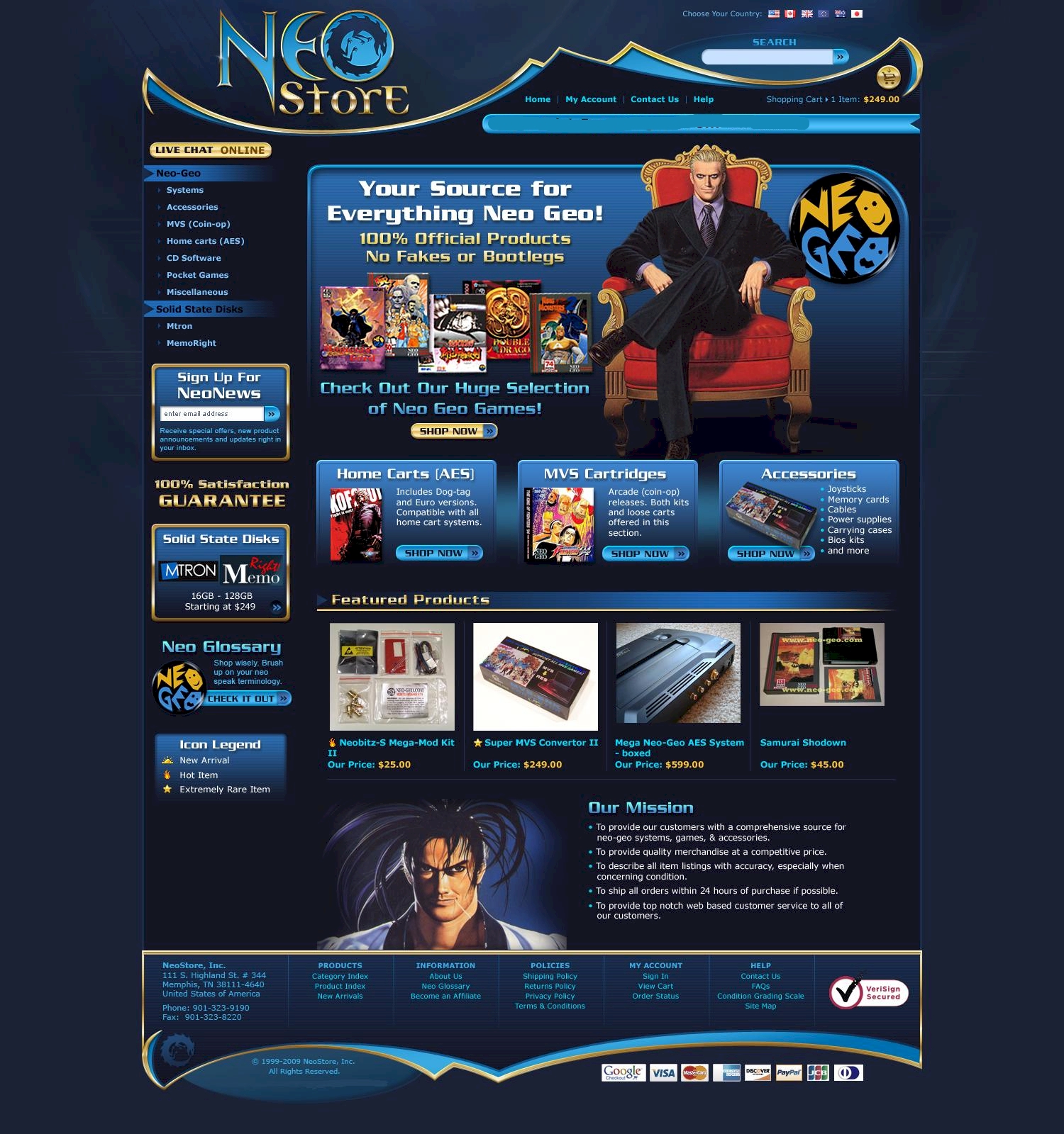
I’m currently undecided on which border is optimal. If the gilded/embellished design is the best choice then bottom border will be modified to match the style of the top border.
Item detail template:
Shopping cart template:
Last edited: