You are using an out of date browser. It may not display this or other websites correctly.
You should upgrade or use an alternative browser.
You should upgrade or use an alternative browser.
Shawn - $499 prize for designing a Neo-Geo game title logo!
- Thread starter Shawn
- Start date
SHOGUNATE_LSD
War Room Troll
- Joined
- Jan 27, 2014
- Posts
- 21
In the final 8, 6 are full insert art but two are logos only?
On top of that, out of the 6 that are actually full case art, 2 have the original Neo logo, and on the other 4 the text is not aligned even a little bit!
Are you telling me that out of 195 entries only TWO DESIGNS even had the "neo geo" and "ARCADE ENTERTAINMENT SYSTEM" text aligned properly?
 <- If you don't see anything wrong with this picture, for THE ENTIRE WORLD'S sake, DON'T EVER put your opinion in on any design related anything ever again.
I'm shocked designs this bad made it into the final 8. I am voting for one of the designs that is just a logo and hoping it turns into something that doesn't look like 0 effort magic wand trash.
I would have whipped something up myself but theres no way I would buy this cart, no thanks.
On top of that, out of the 6 that are actually full case art, 2 have the original Neo logo, and on the other 4 the text is not aligned even a little bit!
Are you telling me that out of 195 entries only TWO DESIGNS even had the "neo geo" and "ARCADE ENTERTAINMENT SYSTEM" text aligned properly?
I'm shocked designs this bad made it into the final 8. I am voting for one of the designs that is just a logo and hoping it turns into something that doesn't look like 0 effort magic wand trash.
I would have whipped something up myself but theres no way I would buy this cart, no thanks.
Last edited:
- Joined
- Apr 26, 2002
- Posts
- 15,120
I would have whipped something up myself but theres no way I would buy this cart, no thanks.
Join Date Jan 2014
Location new england
Posts 12
.
EllertMichael
Mickey's Coach

- Joined
- Dec 8, 2011
- Posts
- 579
Congrats and Good Luck to all the finalists.

El Maricon Loco
Galford's Poppy Trainer,
- Joined
- Apr 23, 2003
- Posts
- 3,513
Under the strict supervision of AES aficionados, I'm going finish a version of my AES style insert that focuses on the actual games in the cart. Guaranteed to shelf gorgeously with all the other shit collecting dust. Gold accents will be personally hand pressed in 24k gold leaf. This is going to be a 1 of 1 piece, price is to be determined.
Attachments
Last edited:
- Joined
- Jan 22, 2012
- Posts
- 7,634
Under the strict supervision of AES aficionados, I'm going finish a version of my AES style insert that focuses on the actual games in the cart. Guaranteed to shelf gorgeously with all the other shit collecting dust. Gold accents will be personally hand pressed in 24k gold leaf. This is going to be a 1 of 1 piece, price is to be determined.
By far the best entry.
Why didn't you throw your hat in the ring?

- Joined
- Oct 2, 2003
- Posts
- 7,576
Congrats and Good Luck to all the finalists.
HAHAHA
SHOGUNATE_LSD
War Room Troll
- Joined
- Jan 27, 2014
- Posts
- 21
If the day ever comes that I want to play a bunch of romhacks on my AES i will write you an apology letter an send it express mail. Promise!
- Joined
- Jun 5, 2003
- Posts
- 1,810
Like the new banner. ")
- Joined
- Apr 26, 2002
- Posts
- 15,120
If the day ever comes that I want to play a bunch of romhacks on my AES i will write you an apology letter an send it express mail. Promise!
If there's ever a time the world thinks someone has outlaw relevance because they put drug references in their username, I'll make sure to reply!
Idiot.
- Joined
- Dec 26, 2000
- Posts
- 13,852
My vote goes to whoever did the Terry-being-violated-by-home-carts logo at the top of the forum. It's probably the best logo you're going to get for a 161n1 cart.
- Joined
- Jan 22, 2012
- Posts
- 7,634
Back from vacation
Where did you go?
SHOGUNATE_LSD
War Room Troll
- Joined
- Jan 27, 2014
- Posts
- 21
If there's ever a time the world thinks someone has outlaw relevance because they put drug references in their username, I'll make sure to reply!
Idiot.
SHIT! I've been caught by the internet police!
Pope Sazae
Known Scammer, DO NOT DEAL WITH!, The Management.,
- Joined
- Dec 9, 2007
- Posts
- 3,480
Back from vacation.
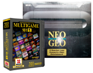
Here's my final Multigame Logo design.
MG1 and MG2 are all hand drawn letters.
When the spine is vertical, you can easily read: 161-IN-1
Did you pick #8 for your cart before I did? Guess we will see in Match.
Back from vacation.
Here's my final Multigame Logo design.
MG1 and MG2 are all hand drawn letters.
When the spine is vertical, you can easily read: 161-IN-1
8man

Yess it good this, really.. Finally something original ..
I vote for this one to have it on the insert…
Last edited:
- Joined
- Aug 16, 2011
- Posts
- 3,408
My vote goes to whoever did the Terry-being-violated-by-home-carts logo at the top of the forum. It's probably the best logo you're going to get for a 161n1 cart.
QFT.
8man
Administrator
- Joined
- Aug 13, 2005
- Posts
- 321
Where did you go?
Mars.
REKALL REKALL REKALL
Dang! El Pantalones is really close.
We were in Africa (Morocco) for 10 days.
Private driver and guide in a 4x4 Land Cruiser.
Drove all over Morocco: Casablanca, Marrakech, Fes, Meknes, Rabat, Erfoud, through the snowy Atlas Mountains and off-roading in the Sahara Desert.
In the Sahara Desert the sun gets soo hot that it turns the sand and rocks black... it looked like MARS.
Even stayed in tents, in the middle of the desert, 20 miles away from the Algerian border.
From there we flew to Spain (Madrid and Toledo) for 4 days. I was able to check my email and neo-geo.com in Madrid, and I saw the design contest. I hand sketched out two designs for the contest on the back of a restaurant flyer.
Finally home, I created the design you see now.
If you like it, VOTE for it!
I want it on my copy of the insert!!
- Joined
- Aug 20, 2000
- Posts
- 60,434
Cool story, Mark. Sounds like a good adventure. My experience with Morocco was a bit more dangerous.
- Joined
- Oct 31, 2005
- Posts
- 4,281
So wait, if this is a boot (fake shit) and it isn't sanctioned by SNK Playmore, why is it being advertised? And why is it even being made?
Because $
It's only okay to sell pirated bootleg stuff if you are making a metric fuck tonnes of money off of it, present it as if it is a legit high quality non-stolen product, and run the store or something like that I think. I'm pretty sure it says that in the market place rules.