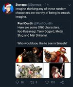
I always thought of Kyo as the face of KoF and not the "mascot" of SNK.
For a while there,
KoF WAS
SNK but they made the critical mistake of driving their art direction towards fashion trends rather than the timeless art direction of other series.
There is no doubt that some of those characters are very striking in their design. Iori comes to mind, as does Shermie. But when I think of the art direction of characters specific to
KoF, I think of the characters that would look great in any fighter:
Chin Gentsai
Kensou
Athena
Goro Daimon
All of Ikari (including Leona and Whip)
Choi Bounge
Chang Koehan
There are more, but the point I'm trying to make here is that while none of these were 'excellent' designs, they were good
video game characters that followed an archetype while maintaining their own unique flavor. Martial artists, soldiers, a convict and a chibi Freddy Kreuger. All of these things are pop culture staples with designs rooted in the familiar. Just like a guy in a karate gi or a sumo outfit or a Chinese dress or Mike Tyson or a power mad dictator.
I don't want anyone to think that I loathe the
KoF art direction. On the contrary, it was something that made SNK unique and different and I rather like it. But as those 90s anime tropes aged out, it got replaced with Falcoon's city pop style when what SNK needed was to capitalize on their popularity and establish some new franchises, maybe that weren't fighters, that might have grown their business model with the types of games that would have been new for them but might have been more famiiar to consumers.
They tried with stuff like
Cool Cool Toon, a game WAY ahead of its time in my opinion, but that's just it. It was too niche and they needed something more recognizable. Conquering Japan is one thing. Capcom conquered the world so successfully that even today, after years and years of financially questionable business practices, they're still around and still very relevant to the market.
Honestly, they should have just put Terry's silhouette from
Real Bout with the white star on his back next to the logo. That was imagery meant for it.


